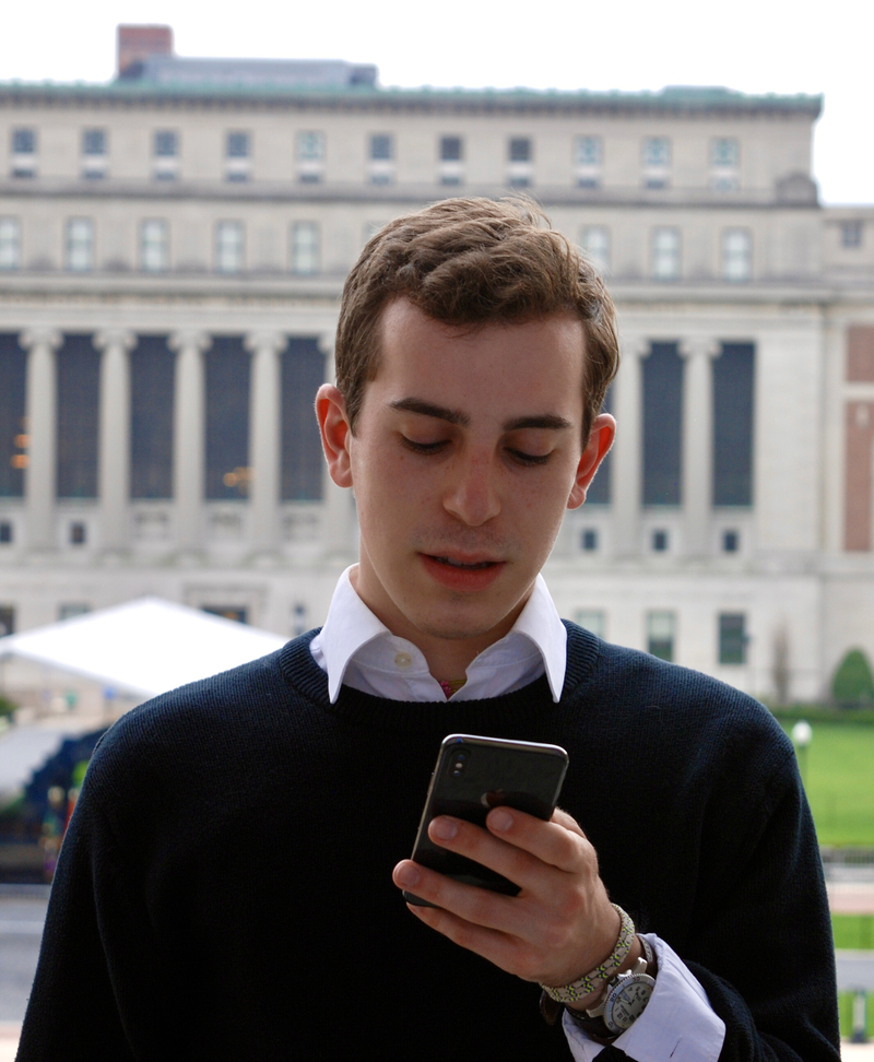
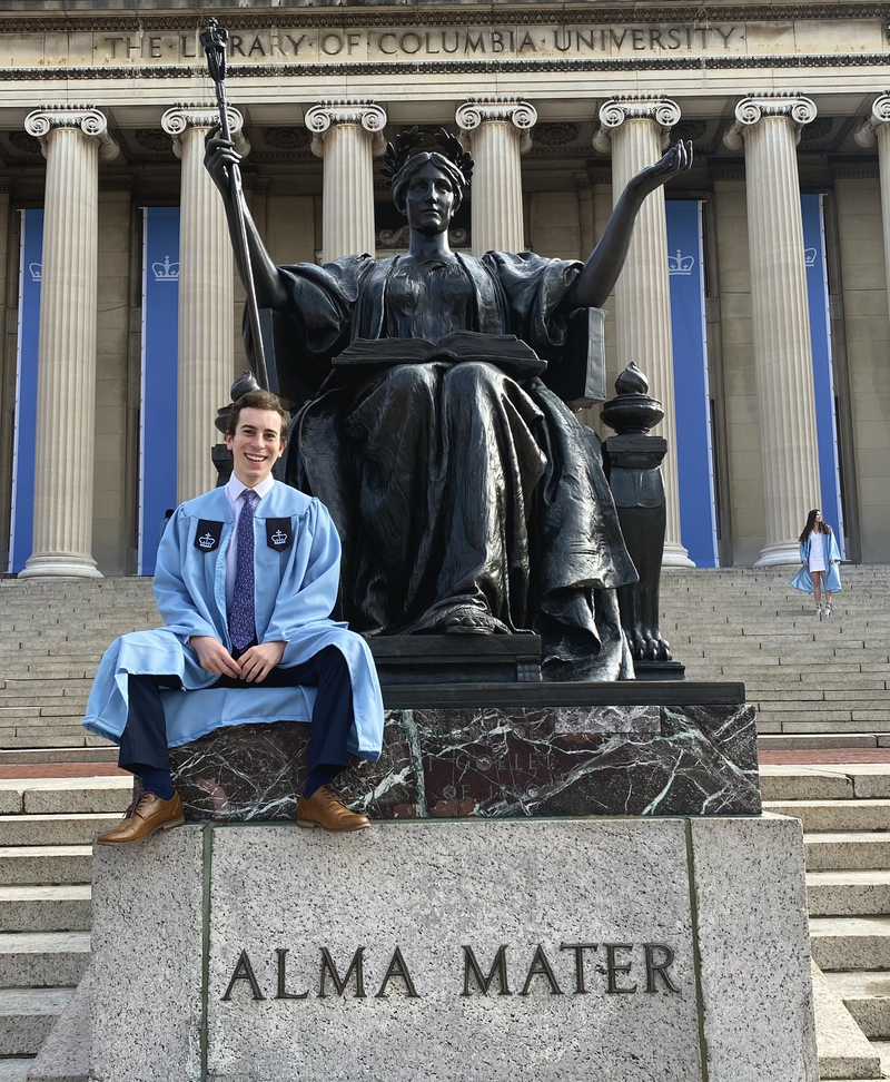
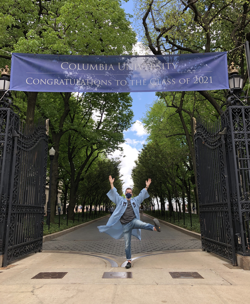
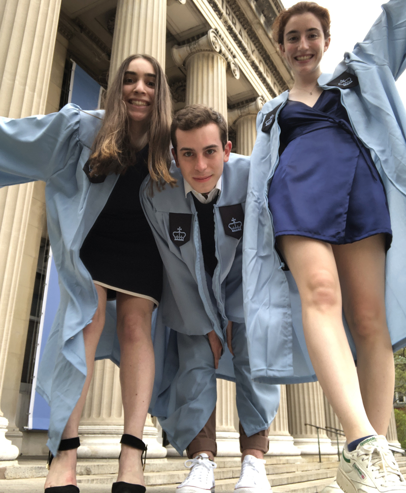
🌇

hi, i'm spencer


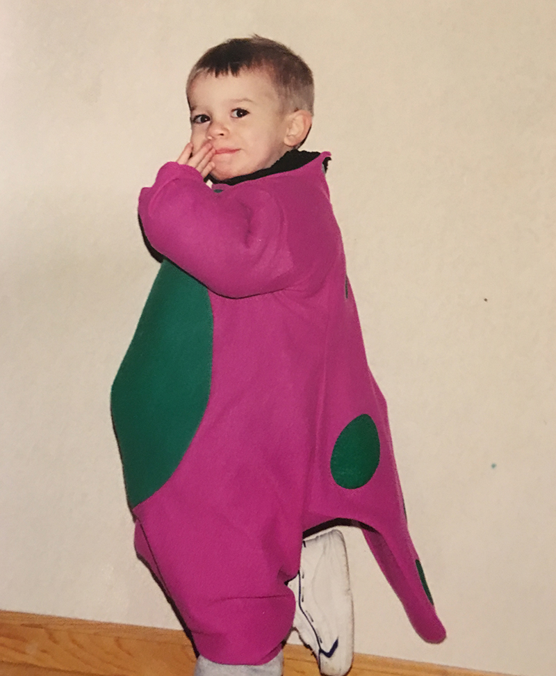
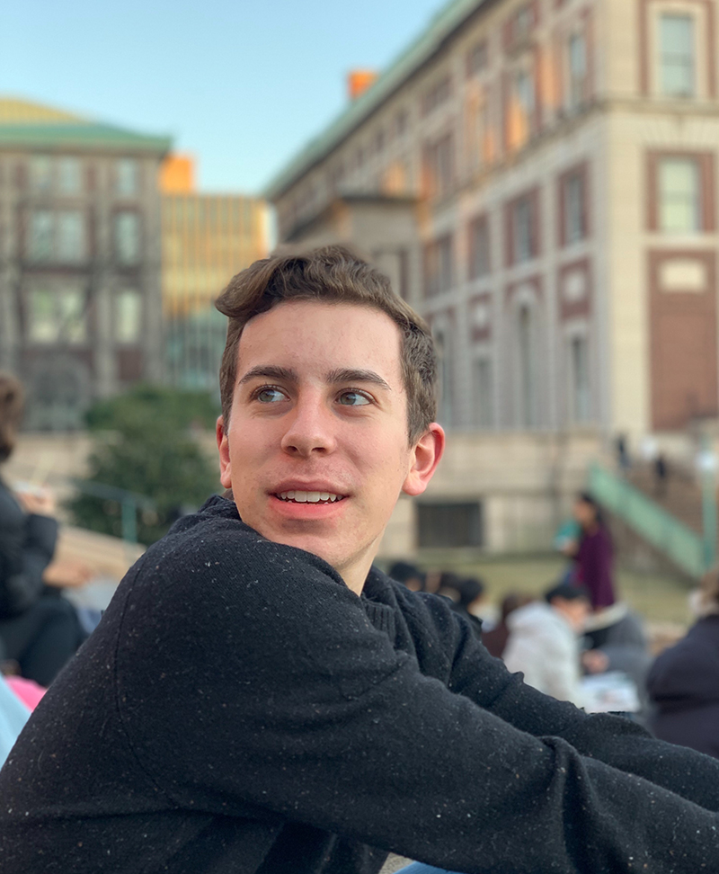
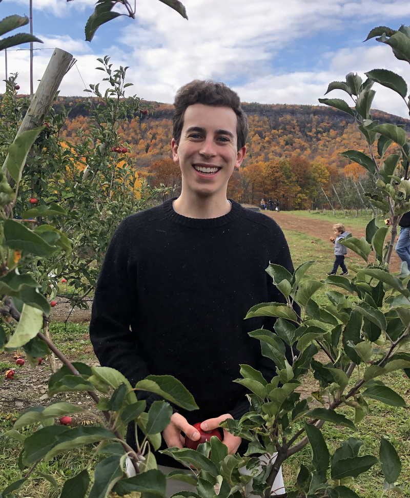
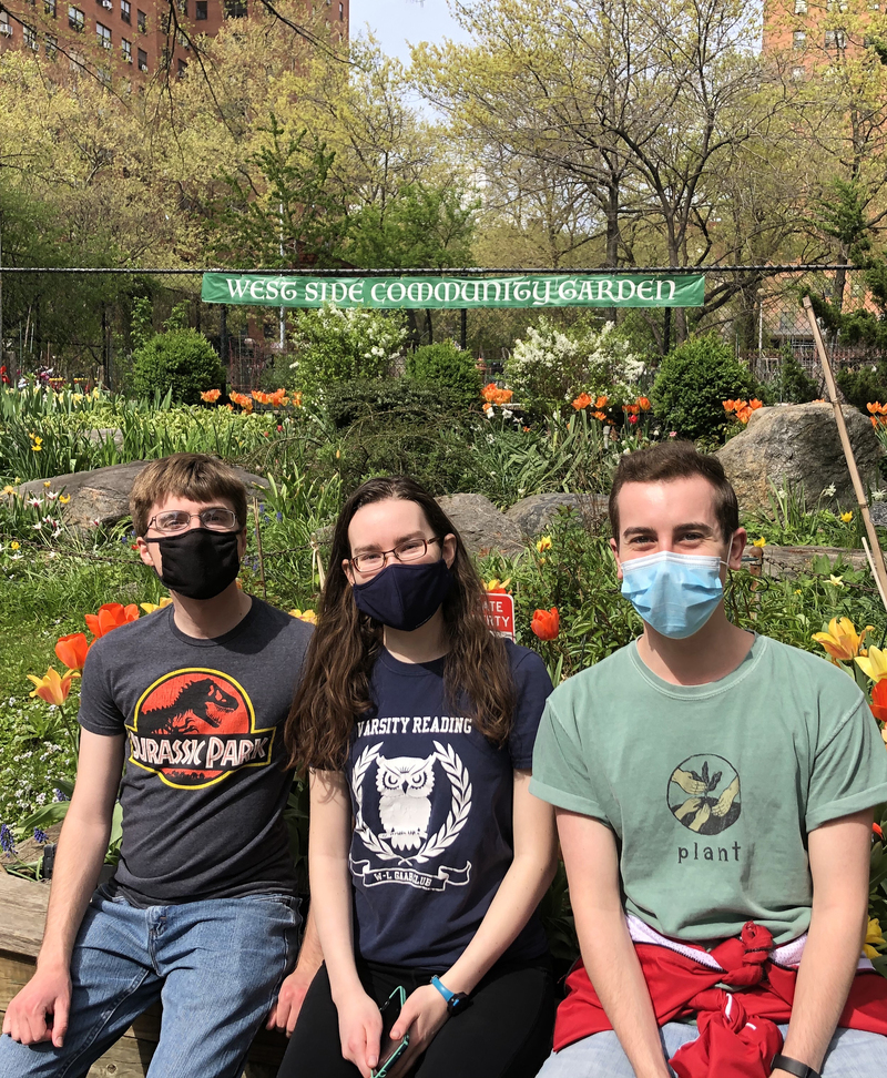
thanks for stopping by ☺️
here's a bit about me:

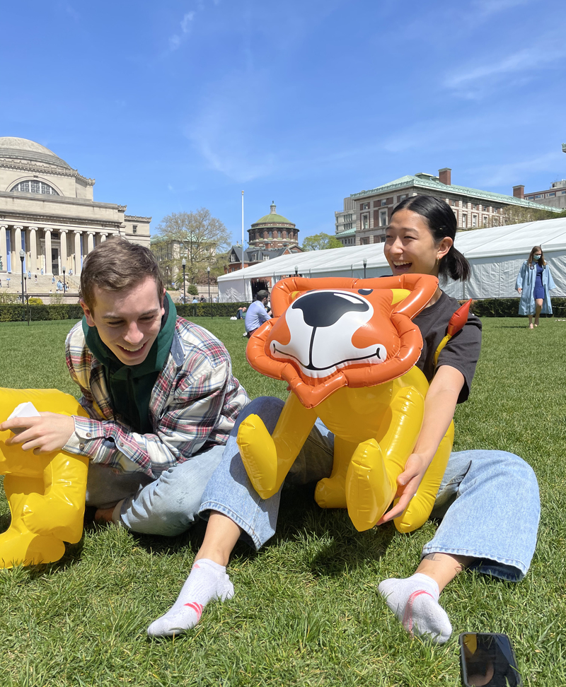
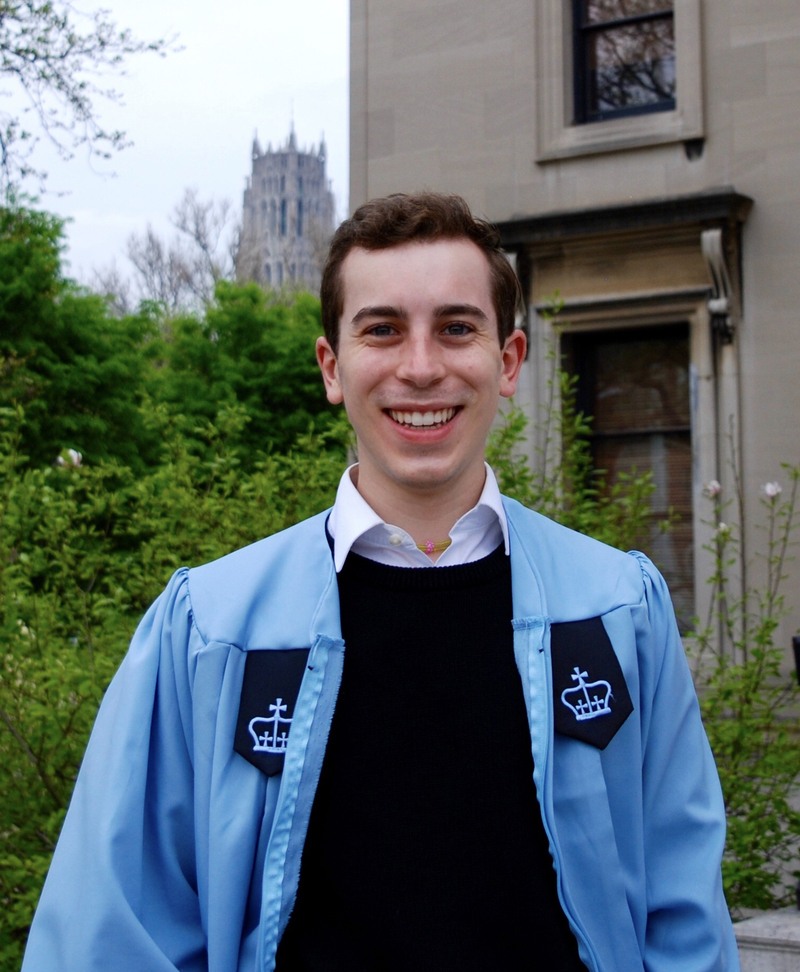
I graduated in April of 2021 from Columbia Univeristy's engineering school, where I received my B.S. in Computer Science and Sociology.

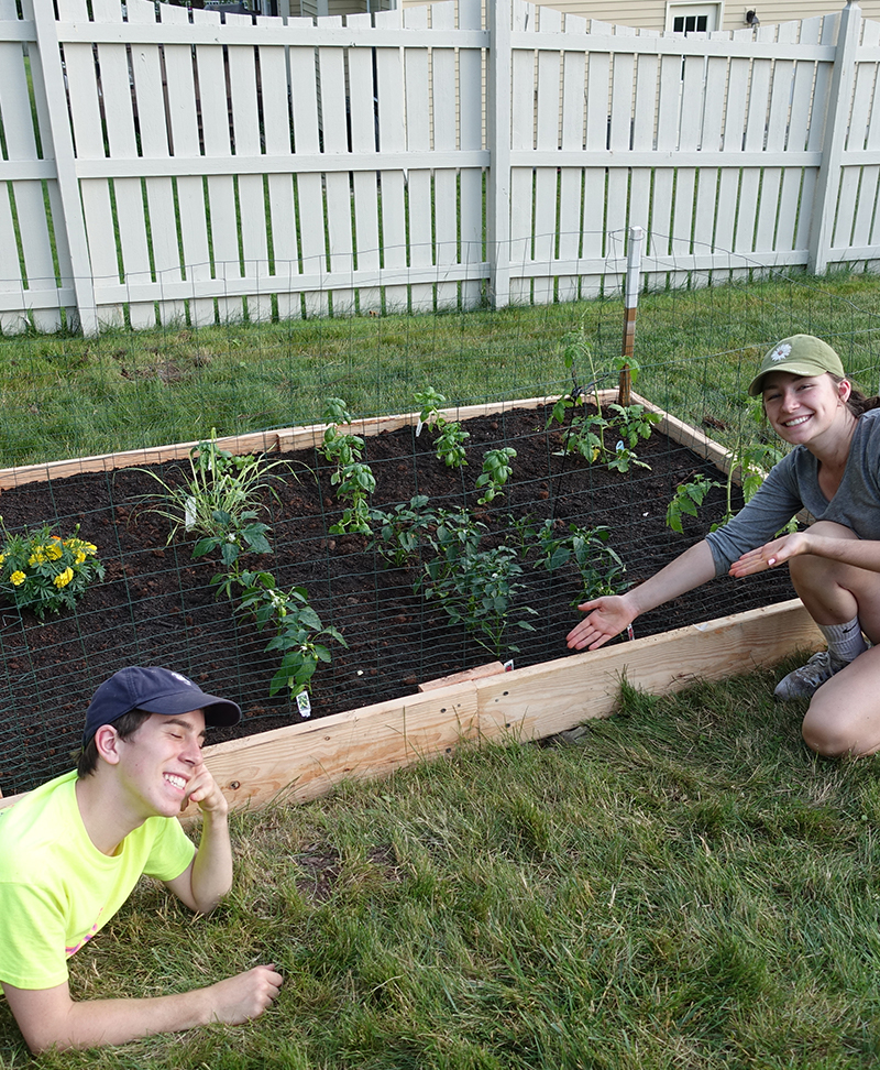
Since then, I've worked as a ballperson at the U.S. Open for 4 years running, traveled the U.S. by train, and savored time, laughs, and sweets shared with family and friends. I currently work at The Change Climate Project on the engineering team, building up infrastructure for companies to reliably measure, offset, and reduce their emissions with less fuss and more support.

If you have a project that helps to make this 🌎 a safer, greener, and more equitable place: that sounds right up my alley, please drop me a line!

A green rectangle has the Columbia Ecoreps logo in the center. When hovered over, a gif plays. The gif shows a panning shot over a large room filled with belongings for sale. It is the Green Sale, held annually during move in to help students find low-cost pre-loved dorm room supplies, decorations, and textbooks. A green rectangle has the Columbia Ecoreps logo in the center. When hovered over, a gif plays. The gif shows a panning shot over a large room filled with belongings for sale. It is the Green Sale, held annually during move in to help students find low-cost pre-loved dorm room supplies, decorations, and textbooks.
EcoReps Greensale + Recycling Committee

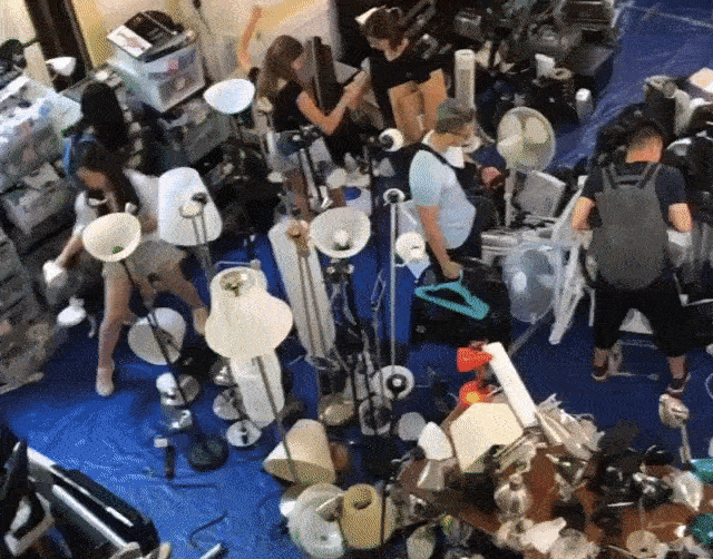
EcoReps saves over 100,000 pounds of waste from going to the landfill every year! Stacking fridges is hard, but made easier with friends 💚

A CAD mockup of a four-legged spherical robot. When hovering your mouse over this image, a GIF plays of Spencer holding one leg of this robot as it moves through a crawling walk cycle. A CAD mockup of a four-legged spherical robot. When hovering your mouse over this image, a GIF plays of Spencer holding one leg of this robot as it moves through a crawling walk cycle.
Quadruped Robot

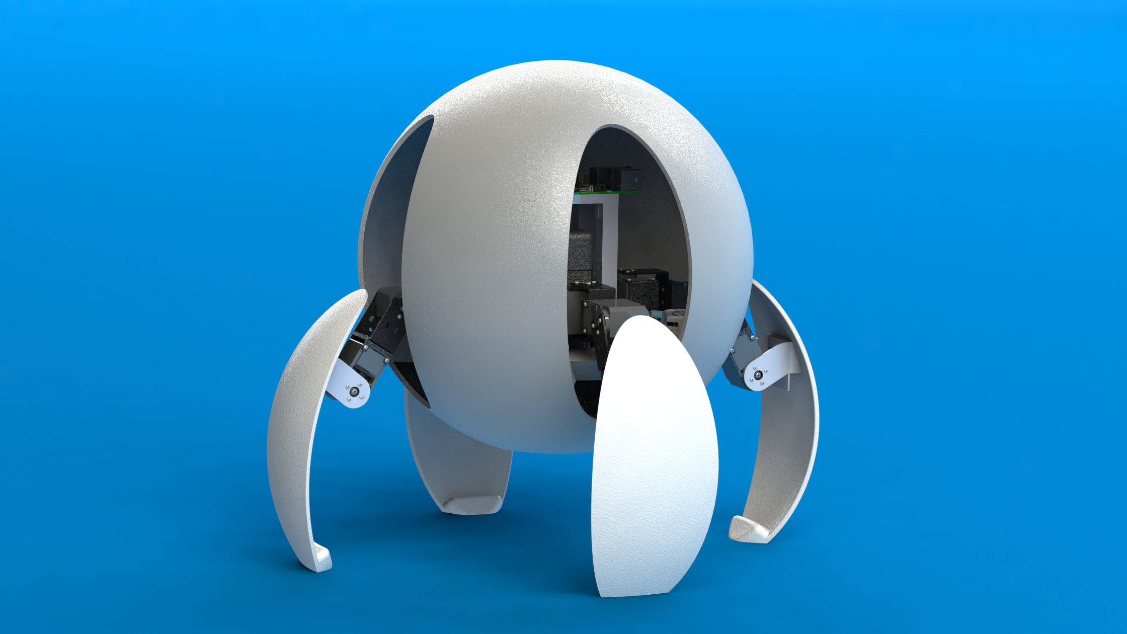
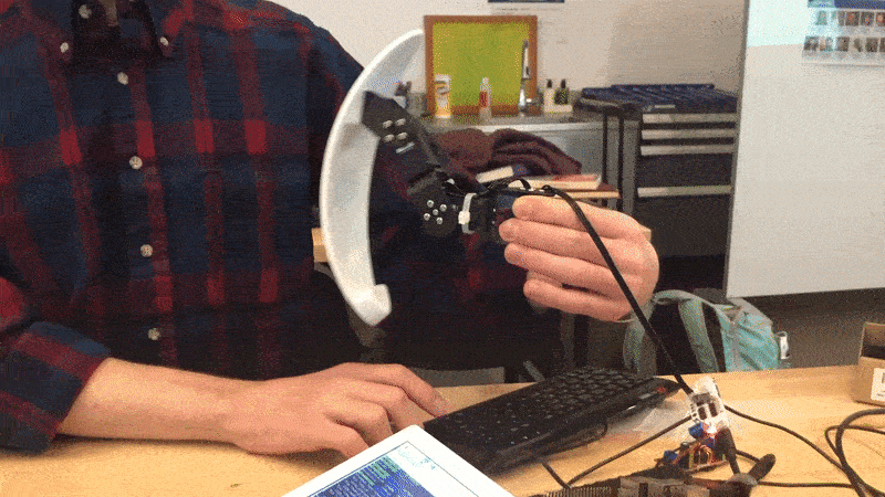
A 4-legged robot I designed, built, iterated upon, and endlessly troubleshot in Hod Lipson's robotics studio.

A blue image with the Columbia Daily Spectator logo is shown. When hovered over, a gif plays where a mouse hovers over an interactive data vizualization with paired histograms. The graph shows the top five majors in Columbia College and Columbia Engineering. A blue image with the Columbia Daily Spectator logo is shown. When hovered over, a gif plays where a mouse hovers over an interactive data vizualization with paired histograms. The graph shows the top five majors in Columbia College and Columbia Engineering.
Columbia Daily Spectator

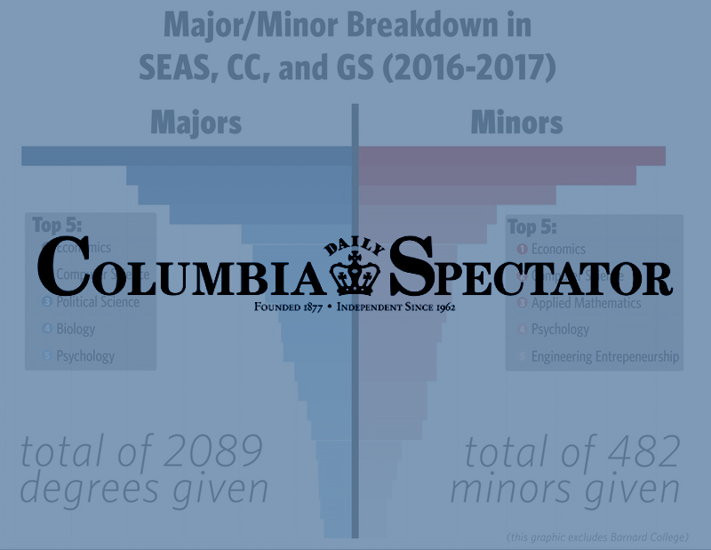
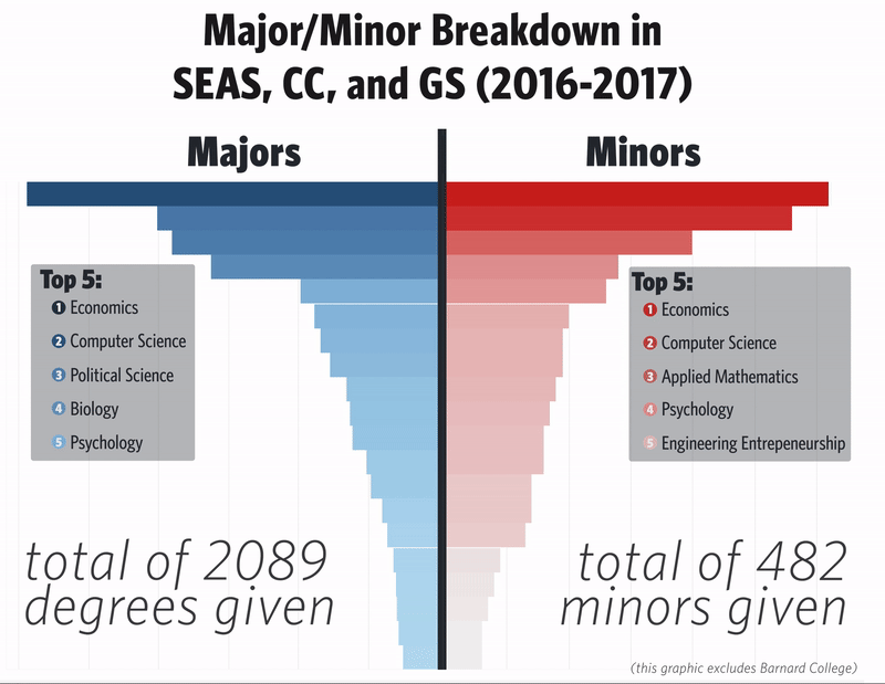
In college, I worked with Columbia Daily Spectator in bringing creative data viz and illustration to both print and our website.

A gif of the interaction with a multi-line chart that depicts the number of Spotify streams for each song encoded in one line. The lines are color-coded as dark blue when the song is trending on TikTok, light blue when the song is not trending on TikTok, and orange when the song has never trended on TikTok. There is the ability to scroll left and right through time, hover over a date in the span of time, and zoom in to see more detail. A gif of the interaction with a multi-line chart that depicts the number of Spotify streams for each song encoded in one line. The lines are color-coded as dark blue when the song is trending on TikTok, light blue when the song is not trending on TikTok, and orange when the song has never trended on TikTok. There is the ability to scroll left and right through time, hover over a date in the span of time, and zoom in to see more detail.
TikTok on the Spot

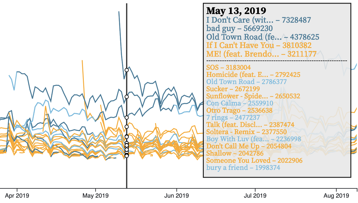
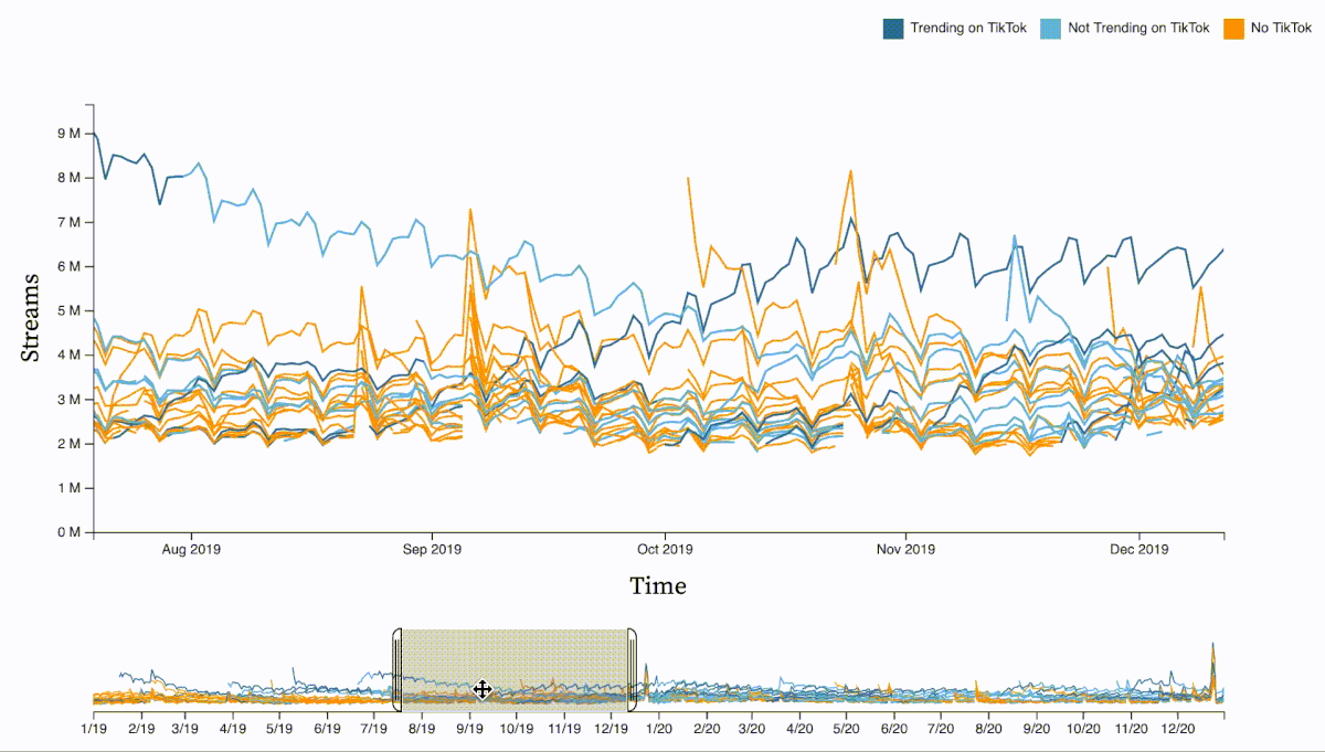
An interactive depicting the link between Spotify streams and TikTok audio popularity.

A gif of the interaction with a parallel coordinate diagram. Each column represents one metric of data for each state, and the column can be rearranged by clicking and dragging on the column title. This redistributes the parallel coordinate chart accordingly. Hovering over a line (state) reveals a tooltip with that state's selected demographic and COVID-19 information. A gif of the interaction with a parallel coordinate diagram. Each column represents one metric of data for each state, and the column can be rearranged by clicking and dragging on the column title. This redistributes the parallel coordinate chart accordingly. Hovering over a line (state) reveals a tooltip with that state's selected demographic and COVID-19 information.
COVID-19 + State-Level Demographics Dashboard

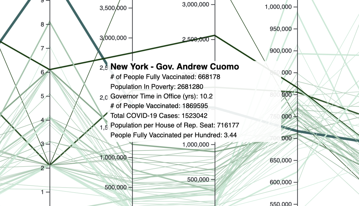
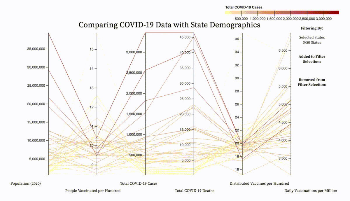
A dashboard to explore potential links between various state demographics + COVID-19 data.

A gif of the interaction with a schedling page. On the first page, circular progress arcs can be seen on the left depicting the user's progress through their major. Then, on the right, an interactive checklist depicts which requirement(s) are needed to satisfy different track requirements for the student. On the page to the right, a weekly planner is shown on the right and a shortlist of classes can be filtered and searched on the left. A gif of the interaction with a schedling page. On the first page, circular progress arcs can be seen on the left depicting the user's progress through their major. Then, on the right, an interactive checklist depicts which requirement(s) are needed to satisfy different track requirements for the student. On the page to the right, a weekly planner is shown on the right and a shortlist of classes can be filtered and searched on the left.
UI/UX Design User Study

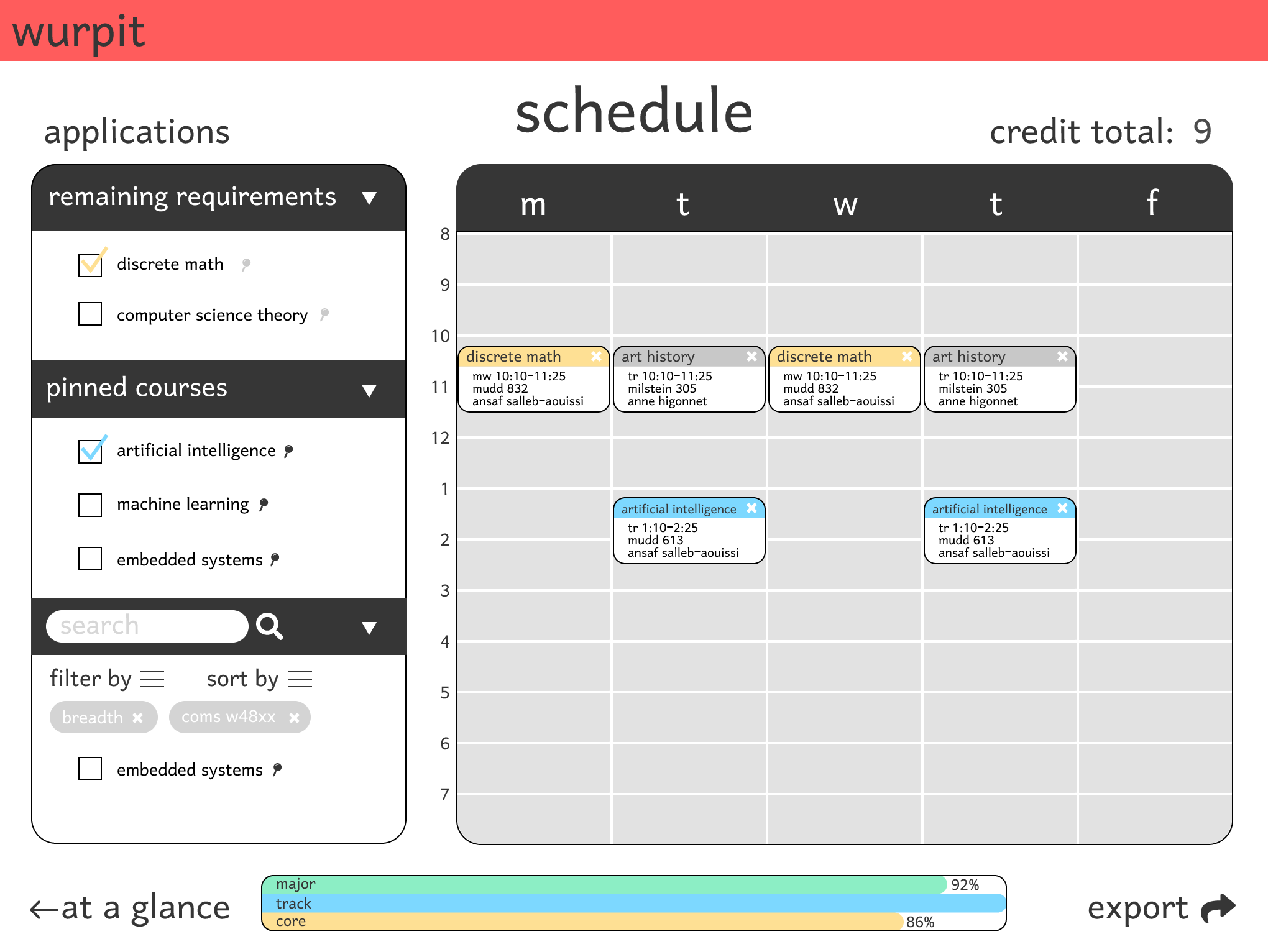
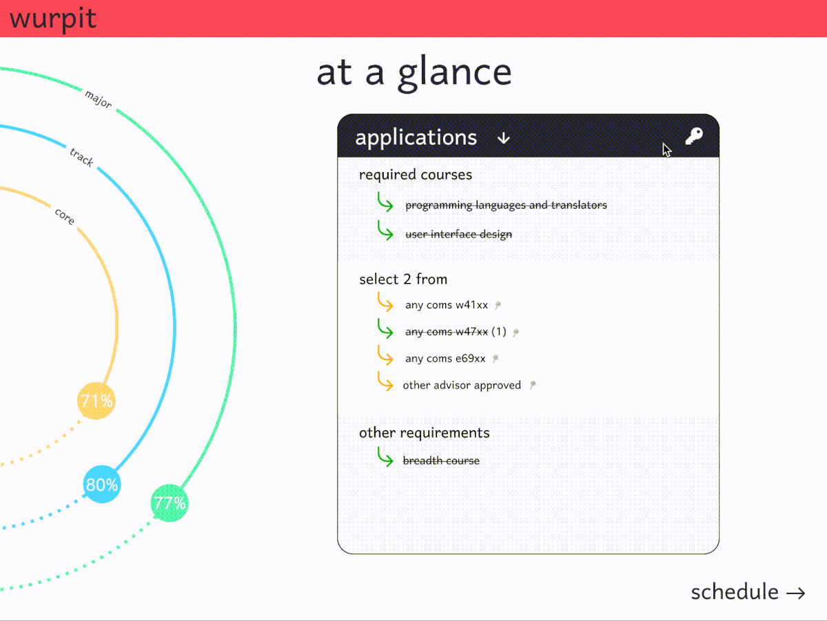
A final project where Sam Ross, Nadia Jurkovich, Vishnu Nair, and myself conducted user studies, designed, and iterated on an idea for a new course scheduling interface.

A gif of a flip dot display flipping individual disks between black and white. A gif of a flip dot display flipping individual disks between black and white.
Flip Dot Display

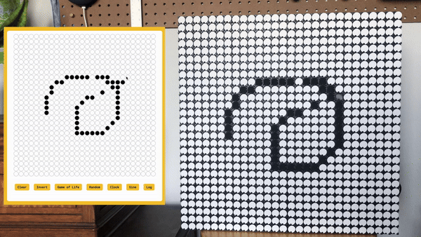
A fun use of secondhand AlfaZeta flip dot boards, a Raspberry Pi, and a simple flask app.

A picture of a COVID-19 facemask with strips of LEDs along the front. The picture is animated to show how the mask lights up and each of the individual LEDs can display its own color. The mask writes out the letters C E S, and below the mask is a blue rectangle with a joystick on the left and two square buttons on the right. This controller has a switch near the bottom edge and wires poking out of the bottom. A picture of a COVID-19 facemask with strips of LEDs along the front. The picture is animated to show how the mask lights up and each of the individual LEDs can display its own color. The mask writes out the letters C E S, and below the mask is a blue rectangle with a joystick on the left and two square buttons on the right. This controller has a switch near the bottom edge and wires poking out of the bottom.
LED Facemask

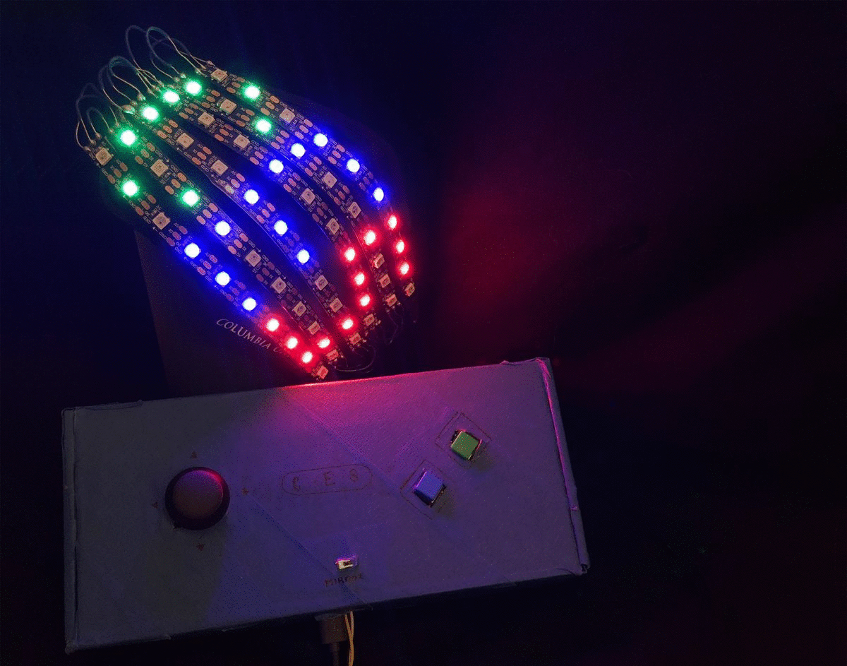
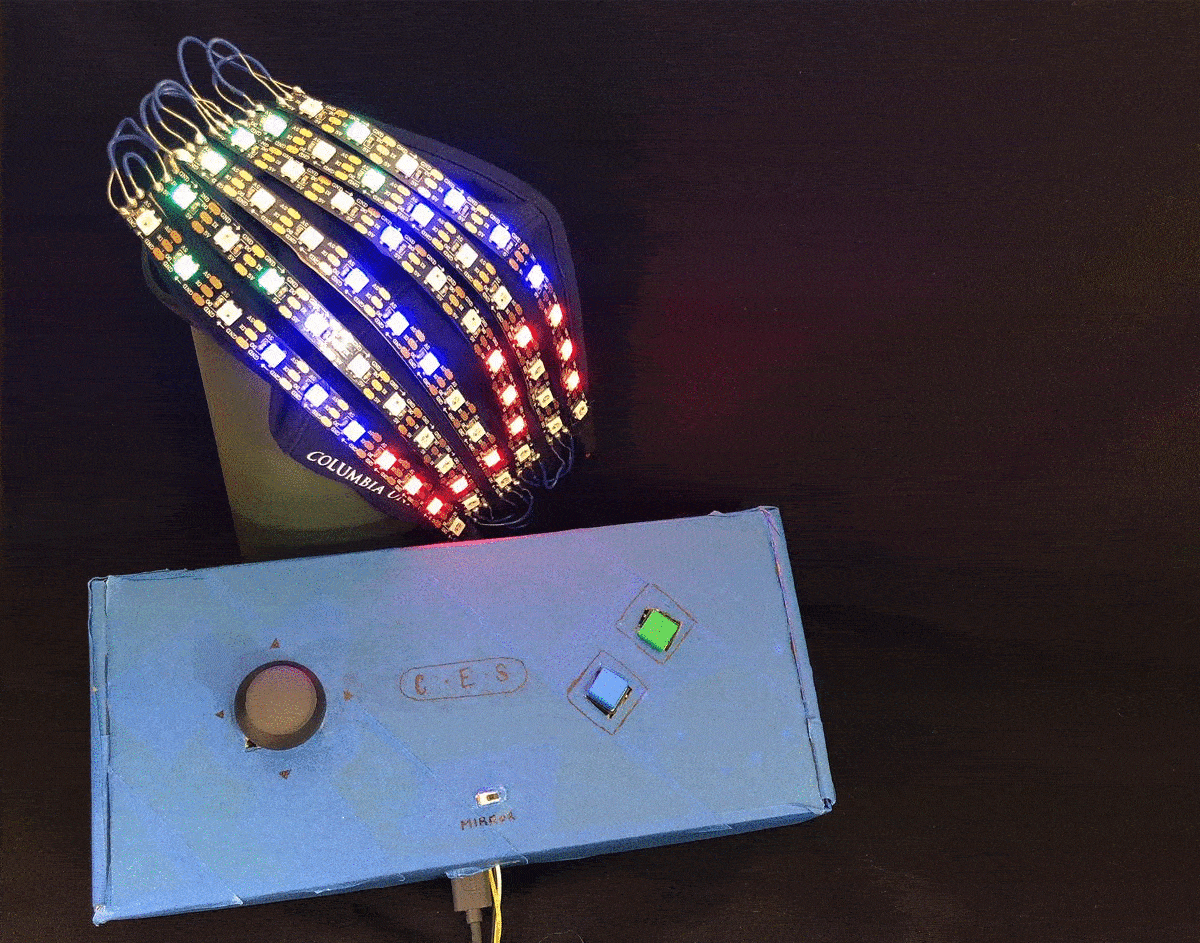
A fun billboard mask project that uses some LEDs, a spare reusable face mask, and pandemic free time.

A Poland flag is partially obscured by the color blue, except in the center where the outline of the Twitter logo bird is seen. Hovering over this image plays a gif where the frame zooms into different red-white boundaries in a random image of a kitchen. A Poland flag is partially obscured by the color blue, except in the center where the outline of the Twitter logo bird is seen. Hovering over this image plays a gif where the frame zooms into different red-white boundaries in a random image of a kitchen.
Polanding Twitter Bot

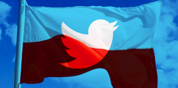
When me and my friend Nadia used Tensorflow Object Detection and the Tweepy Twitter API to make a memebot.